UNIVERSITY PROJECTS
STYLING PROJECT, WHITE PROJECT AND TEXTILES COURSEWORK
STYLING PROJECT
For this elective we were divided into groups and within these groups we were to produce a series of presentations which explored the world of the stylist and developed our concept to a professional standard.
We created a mini advertising campaign, a menswear shoot, based on the trend 'Gender Fluidity'. We named our trend pH7 because the number 7 on a pH scale is neither acidic nor alkaline but in the middle, neutral. We felt this corresponded well with our trend. From there we explored our target publication and target audience, considering a model which best represented our look. As a team, we decided to create an editorial shoot for i-D magazine because we felt the edgy and quirky nature of the magazine would be fitting with our theme. Through our props we wanted to convey our theme and the idea that men are equally addicted to fashion and make up as women are these days. We thought of stereotypical addictions, such as smoking, that we could substitute for make-up within the shoot. For example, instead of cigarettes stubbed out in an ash tray, we would use lipsticks. We then organised everything for our shoot including the styling, casting and props through to the location, lighting and mood, which was carried out the following week. I really enjoyed this project and getting to work in a group with others. We were all very pleased with the final outcome of our shoot.
WHITE PROJECT - FIRST YEAR
Our first project at University was solely based upon the silhouette and manufacture of the garment, therefore the brief only allowed us to create something made totally from white materials. I chose the word 'Fragmented' to base my project upon. At first I looked at the literal meaning of the word; existing or functioning as though broken into separate parts. After further thought, I was drawn to the idea of War and Conflict and how millions of families were 'fragmented' and torn apart when fathers, sons and relatives were waved off to fight for their country. Through further research and using my very own family history, I started to experiment with silhouettes and sculpture on the stand. By manipulating the fabric I was able to create a three-dimensional illusion of a gun shot wound to the left side of the chest on my garment. Resembling the injury my great great grandfather sustained in the First World War.
TEXTILES COURSEWORK
STREET ART
I looked at different graffiti artists, such as Banksy, visited the skater park at South Bank in London and studied the different types of street art. I found the overriding theme was their placement – walls. Taking this idea, I focussed on 'bricking' within my techniques. For example, I layered several pages from a magazine, one on top of each other finishing with an overlay of Lutradur. Using a running stitch, I created a ‘brick wall’ effect; I then melted the Lutradur using a heat gun to give the piece an aged and decaying appearance. I randomly removed squares of ‘bricks’ to reveal different layers underneath; this added depth and colour to my ‘graffiti’ wall vision. I am currently developing this technique by experimenting with the magazine pages and other mediums, such as denim, and my final piece will feature these elements.
I looked at different graffiti artists, such as Banksy, visited the skater park at South Bank in London and studied the different types of street art. I found the overriding theme was their placement – walls. Taking this idea, I focussed on 'bricking' within my techniques. For example, I layered several pages from a magazine, one on top of each other finishing with an overlay of Lutradur. Using a running stitch, I created a ‘brick wall’ effect; I then melted the Lutradur using a heat gun to give the piece an aged and decaying appearance. I randomly removed squares of ‘bricks’ to reveal different layers underneath; this added depth and colour to my ‘graffiti’ wall vision. I am currently developing this technique by experimenting with the magazine pages and other mediums, such as denim, and my final piece will feature these elements.
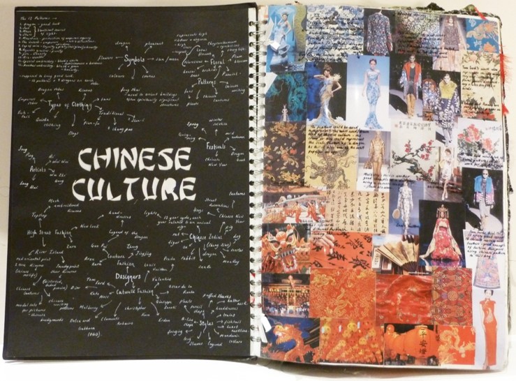
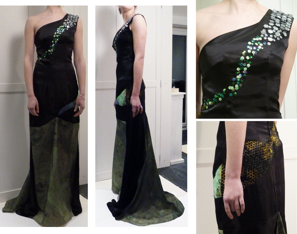
CHINESE CULTURE
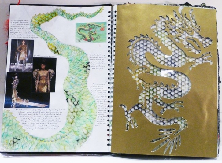
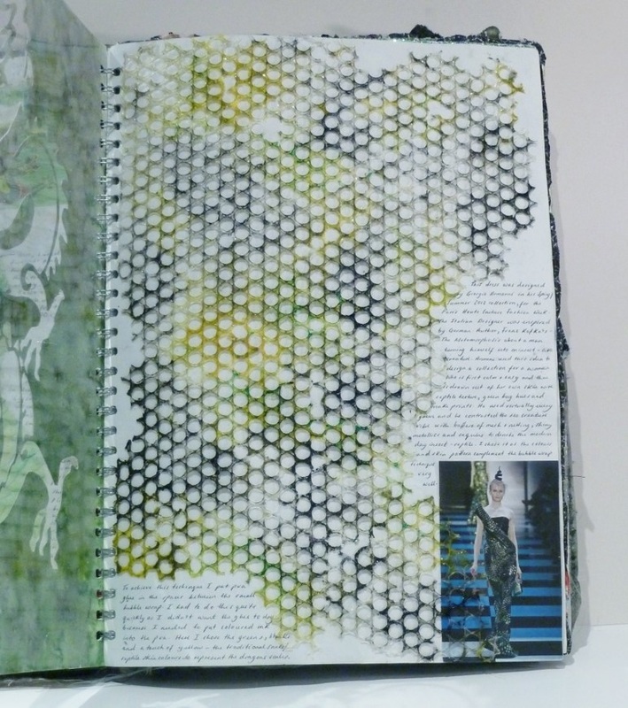
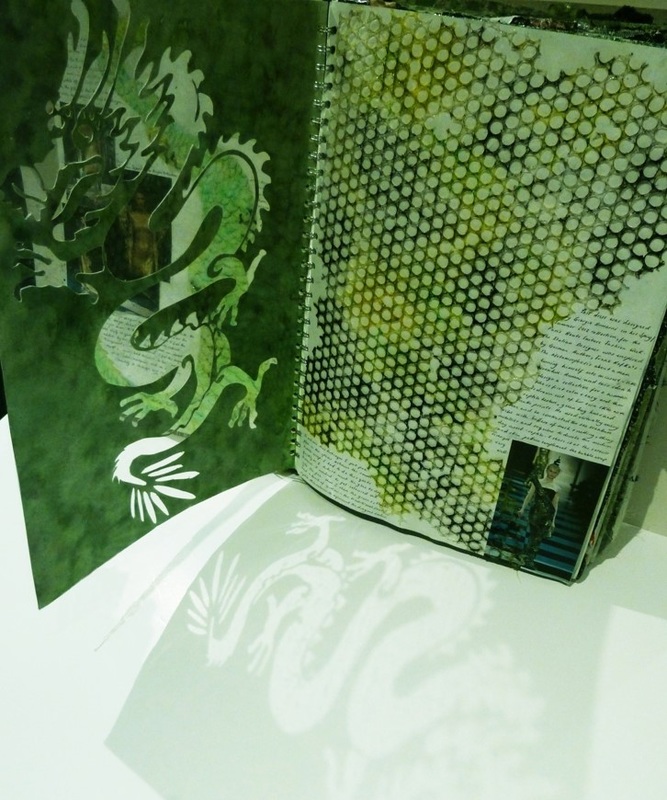
I was drawn to the Twelve Symbols of Sovereignty representing Chinese imperial authority. Seen on the robes of the Emperor, the symbols signify power, strength, good luck, beauty and good fortune; they also provide a rich source of imagery. I mirrored Guo Pei’s use of 3D detailing by using various mediums - such as bubble wrap, glue, inks; graduated circles of fabric; laser-cut hexagons; sequins; marbling - all to create the impression of scales of a dragon. I experimented with draping to understand the fluidity of fabrics, this helped select the ideal materials for the final piece. Using a combination of all of these techniques, I was able to create the effect of a reptile wrapped around the body of the dress.
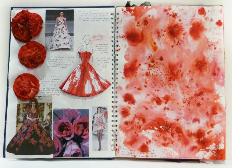
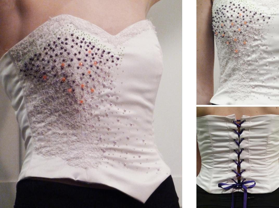
FLOWERS AND LEAVES
I started with Christian Dior’s floral set design at Paris Fashion Week 2014 and this led me to focus on roses and blossom. My inspiration was from Hampton Court Flower Show, Elie Saab, Versace, Ralph & Russo, Barbara Fox’s watercolour paintings and John Rocha’s bird boxes at London Fashion Week, which helped me create my final design. To highlight my technical skills, I used boning to shape the corset, fine free-sewing onto dissolvable fabric to create the lace, then finished with beading, all to emulate blossom. I dip-dyed the fabric and then melted it with a heat gun to resemble the colour graduation and composition of a rose petal on the skirt.
| TEXTILES PORTFOLIO |
